Prediction of the 10-year Cardiovascular Heart Disease
Using the Framingham Heart Study Data
Chapter 3. Data Clean-Up
Once confirming the integrity of data (see Chapter 2), clean-up the data for analysis. First, visulization.
Step 1: Selection of features (i.e., variables)
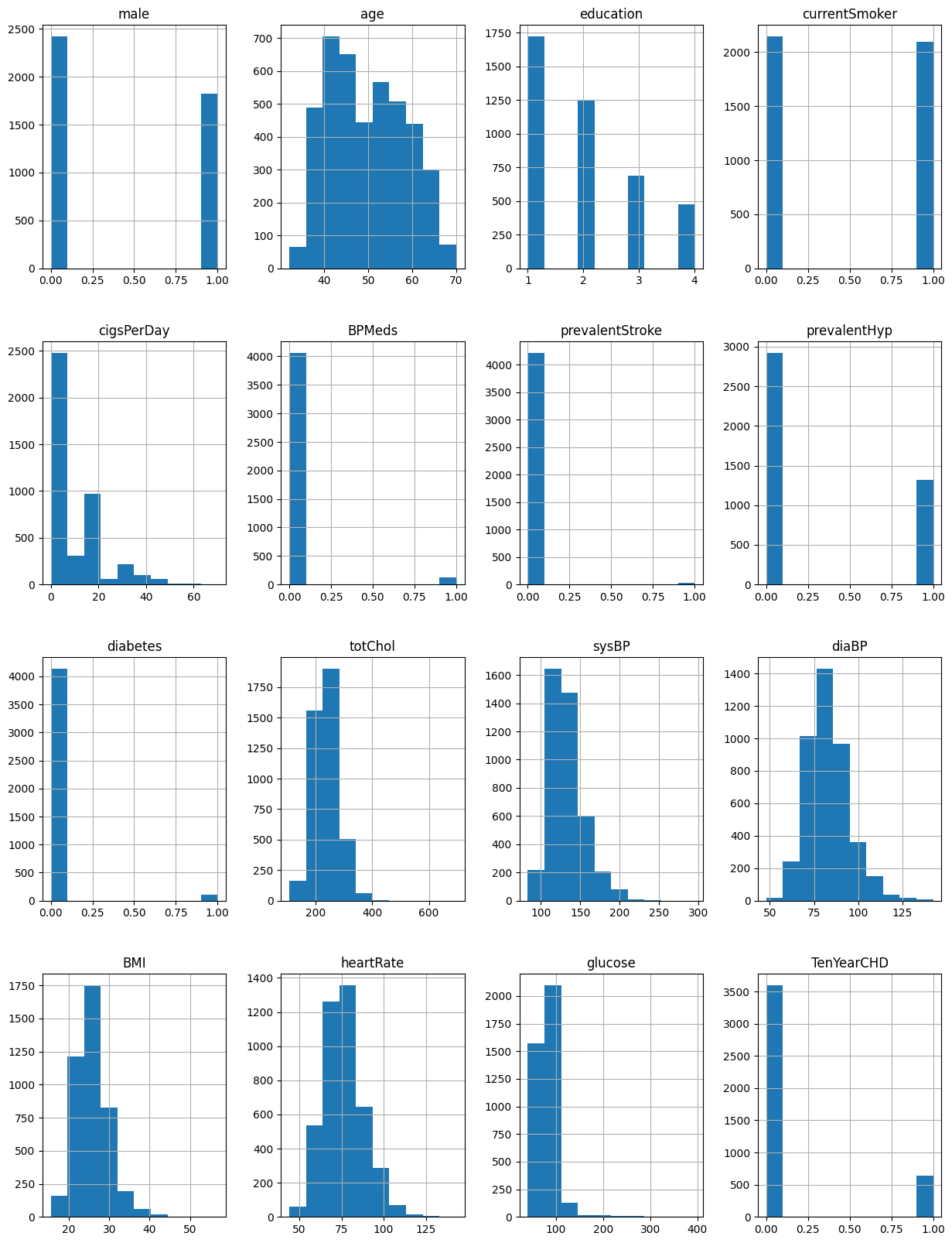
# checking distributions using histograms
fig = plt.figure(figsize = (15,20))
ax = fig.gca()
df.hist(ax = ax)
Figure 1. Histograms of all variables
# checking which features are correlated with each other and are correlated with the outcome variable.
df_corr = df.corr()
sns.heatmap(df_corr)
plt.show()
Figure 2. Heatmap - visual representation of correlation
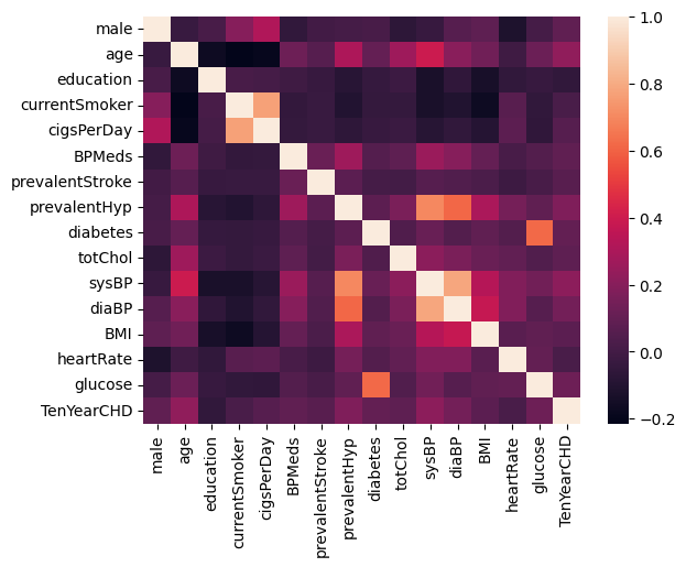
Note: Brighter colors indicate higher correlation while darker colors
lower correlations. Therefore, education was excluded from the analysis.
df = df.drop(['education'], axis=1)
df = df.dropna()
df.isna().sum()
print(df.columns.to_list())
The variable list is:
['male', 'age', 'currentSmoker', 'cigsPerDay', 'BPMeds', 'prevalentStroke', 'prevalentHyp', 'diabetes', 'totChol', 'sysBP', 'diaBP', 'BMI', 'heartRate', 'glucose', 'TenYearCHD']
Step 2: Identify the features (i.e., variables) with the most importance for the outcome variable Heart Disease
Import sckit-learn libraries.
from sklearn.feature_selection import SelectKBest
from sklearn.feature_selection import chi2
Note: independent variables (features) in Capital X while dependent (target) variable is small y.
X = df.iloc[:,0:14]
y = df.iloc[:,-1]
One way of reducing the number of variables to
apply SelectKBest class to extract top 10 best features.
bestfeatures = SelectKBest(score_func=chi2, k=10)
fit = bestfeatures.fit(X,y)
dfscores = pd.DataFrame(fit.scores_)
dfcolumns = pd.DataFrame(X.columns)
Combine the above two data frames for better visualization.
featureScores = pd.concat([dfcolumns, dfscores],axis=1)
featureScores.columns = ['Specs','Score']
print(featureScores.nlargest(11,'Score'))
Table 1. 10 best correlated variables
| |
Specs |
Score |
|---|
| 9 | sysBP | 667.11 |
| 13 | glucose | 402.41 |
| 1 | age | 297.975 |
| 8 | totChol | 252.959 |
| 3 | cigsPerDay | 185.115 |
| 10 | diaBP | 142.92 |
| 6 | prevalentHyp | 82.3422 |
| 7 | diabetes | 31.7113 |
| 4 | BPMeds | 26.1166 |
| 0 | male | 19.1786 |
| 11 | BMI | 17.1082 |
| 5 | prevalentStroke | 8.48098 |
| 12 | heartRate | 3.63548 |
| 2 | currentSmoker | 0.904429 |
Step 3. Visualize the selection
plt.figure(figsize=(20,5))
sns.barplot(x='Specs', y='Score', data=featureScores, palette = "GnBu_d")
plt.box(False)
plt.title('Feature importance', fontsize=16)
plt.xlabel('\n Features', fontsize=14)
plt.ylabel('Importance \n', fontsize=14)
plt.xticks(fontsize=12)
plt.yticks(fontsize=12)
plt.show()
Figure 3. Comparison of features in the order of importance

Step 4. Create new dataframe with selected features
df = df[['sysBP', 'glucose','age','totChol','cigsPerDay','diaBP','prevalentHyp','diabetes',
  'BPMeds','male','TenYearCHD']]
df.head()
Table 2. New dataset
| id | sysBP | glucose | age | totChol | cigsPerDay | diaBP | prevalentHyp | diabetes | BPMeds | male | TenYearCHD |
|---|
| 106 | 77 | 39 | 195 | 0 | 70 | 0 | 0 | 0 | 1 | 0 |
| 121 | 76 | 46 | 250 | 0 | 81 | 0 | 0 | 0 | 0 | 0 |
| 127.5 | 70 | 48 | 245 | 20 | 80 | 0 | 0 | 0 | 1 | 0 |
| 150 | 103 | 61 | 225 | 30 | 95 | 1 | 0 | 0 | 0 | 1 |
| 130 | 85 | 46 | 285 | 23 | 84 | 0 | 0 | 0 | 0 | 0 |
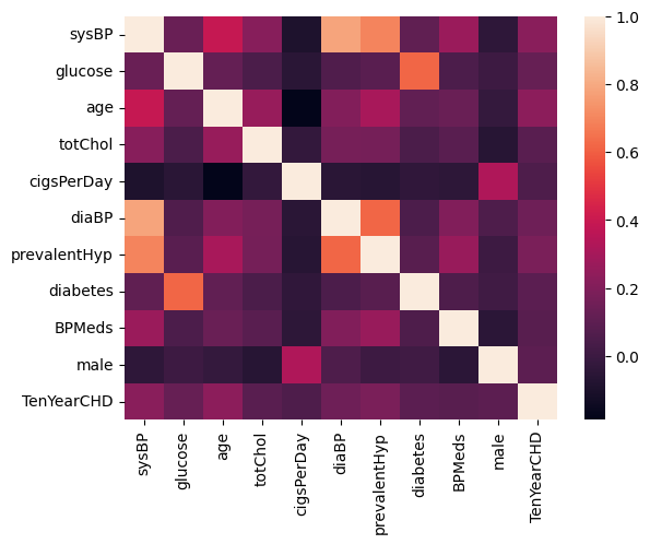
Step 5. Check correlation again
df_corr = df.corr()
sns.heatmap(df_corr)
plt.show()
Figure 5. Heatmap of selected features
Step 6. Checking for outliers
df.describe()
sns.pairplot(df)
plt.show()
Figure 6. Outliers
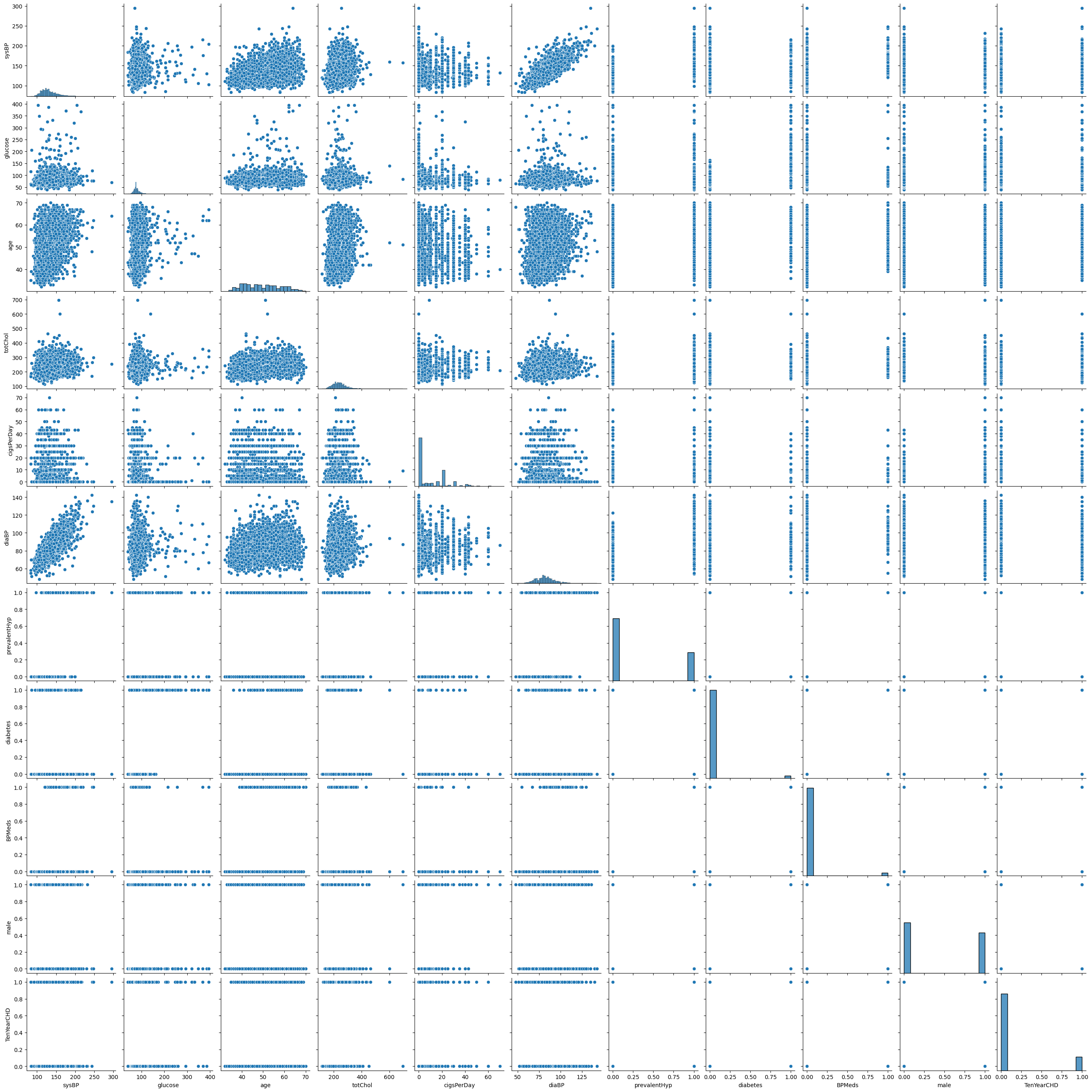
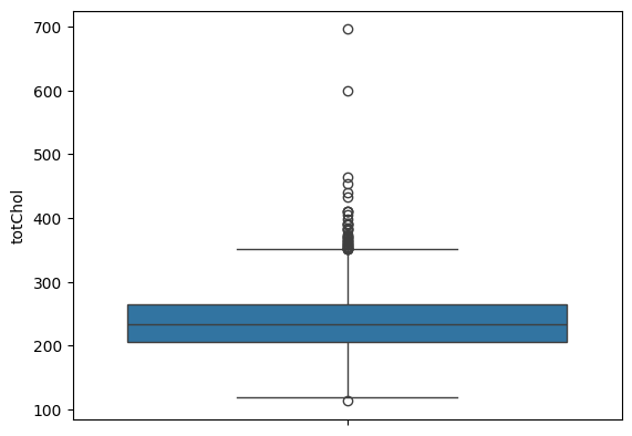
Zooming into cholesterol outliers
sns.boxplot(df.totChol)
outliers = df[(df['totChol'] > 500)]
outliers
plt.show()
Table 3. Two cases of total cholesterol outliers
| | sysBP | glucose | age | totChol | cigsPerDay | diaBP | prevalentHyp | diabetes | BPMeds | male | TenYearCHD |
|---|
| 1111 | 159.5 | 140 | 52 | 600 | 0 | 94 | 1 | 1 | 0 | 0 | 1 |
| 3160 | 157 | 84 | 51 | 696 | 9 | 87 | 1 | 0 | 0 | 1 | 0 |
Figure 7. Outliers - Cholesterol
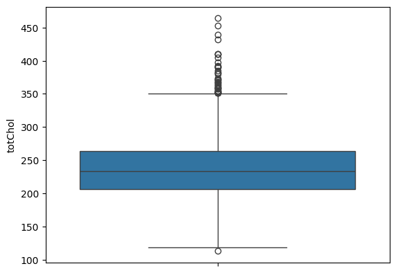
Drop 2 outliers in cholesterol
df = df.drop(df[df.totChol > 599].index)
sns.boxplot(df.totChol)
plt.show()
Figure 8. Outliers Dropped - Cholesterol
Step 7. Preprocessing
In machine learning, the target variable is usually a binary, meaning the value is either 1 (event occurred) or 0 (event not occurred). However, the X features (independent variables or predictors) can be anything (e.g., continous, discrete ordinal, discrete categorical). To be a fair comparison, the units of measurement of X must be compararable to that of y, raning between 0 and 1 [inclusive]. This process is called 'Scale'. It is similar to the standardization (x divided by its standard deviation) where the range of most standardized x can be between - 2 and + 2 (excluding outliers, otherwise the numbers can be huge).
There're several ways of scale: StandardScaler, MinMaxScaler, MaxAbsScaler (according to scikit-learn). These scalers assume the underlying linear relationship between X and y, but I think they can be flexible to adopt non-linear relationship (e.g., quadratic, polynormial, exponentional, logarithmic, or power law, etc.), so that the prediction can be more accurate.
Import scale library.
from sklearn.preprocessing import MinMaxScaler
df_clean = df
scaler = MinMaxScaler(feature_range=(0,1))
Compare these two datasets.
df_scaled = pd.DataFrame(scaler.fit_transform(df_clean), columns=df_clean.columns)
df_scaled.describe()
df.describe()
Table 4. New dataset - scaled
| sysBP | glucose | age | totChol | cigsPerDay | diaBP | prevalentHyp | diabetes | BPMeds | male | TenYearCHD |
|---|
| 0.106383 | 0.10452 | 0.184211 | 0.233618 | 0 | 0.232804 | 0 | 0 | 0 | 1 | 0 |
| 0.177305 | 0.101695 | 0.368421 | 0.390313 | 0 | 0.349206 | 0 | 0 | 0 | 0 | 0 |
| 0.208038 | 0.0847458 | 0.421053 | 0.376068 | 0.285714 | 0.338624 | 0 | 0 | 0 | 1 | 0 |
| 0.314421 | 0.177966 | 0.763158 | 0.319088 | 0.428571 | 0.497354 | 1 | 0 | 0 | 0 | 1 |
| 0.219858 | 0.127119 | 0.368421 | 0.490028 | 0.328571 | 0.380952 | 0 | 0 | 0 | 0 | 0 |
Table 5. Scaled dataset summary
| | sysBP | glucose | age | totChol | cigsPerDay | diaBP | prevalentHyp | diabetes | BPMeds | male | TenYearCHD |
|---|
| count | 3749 | 3749 | 3749 | 3749 | 3749 | 3749 | 3749 | 3749 | 3749 | 3749 | 3749 |
| mean | 0.231 | 0.118 | 0.462 | 0.352 | 0.129 | 0.37 | 0.312 | 0.027 | 0.03 | 0.445 | 0.152 |
| std | 0.104 | 0.067 | 0.226 | 0.124 | 0.17 | 0.126 | 0.463 | 0.162 | 0.172 | 0.497 | 0.359 |
| min | 0 | 0 | 0 | 0 | 0 | 0 | 0 | 0 | 0 | 0 | 0 |
| 25% | 0.158 | 0.088 | 0.263 | 0.265 | 0 | 0.286 | 0 | 0 | 0 | 0 | 0 |
| 50% | 0.21 | 0.107 | 0.447 | 0.345 | 0 | 0.36 | 0 | 0 | 0 | 0 | 0 |
| 75% | 0.284 | 0.133 | 0.632 | 0.43 | 0.286 | 0.444 | 1 | 0 | 0 | 1 | 0 |
| max | 1 | 1 | 1 | 1 | 1 | 1 | 1 | 1 | 1 | 1 | 1 |
Table 6. Original dataset (not scaled)
| | sysBP | glucose | age | totChol | cigsPerDay | diaBP | prevalentHyp | diabetes | BPMeds | male | TenYearCHD |
|---|
| count | 3749 | 3749 | 3749 | 3749 | 3749 | 3749 | 3749 | 3749 | 3749 | 3749 | 3749 |
| mean | 132.355 | 81.864 | 49.572 | 236.709 | 9.011 | 82.935 | 0.312 | 0.027 | 0.03 | 0.445 | 0.152 |
| std | 22.044 | 23.87 | 8.572 | 43.587 | 11.927 | 11.934 | 0.463 | 0.162 | 0.172 | 0.497 | 0.359 |
| min | 83.5 | 40 | 32 | 113 | 0 | 48 | 0 | 0 | 0 | 0 | 0 |
| 25% | 117 | 71 | 42 | 206 | 0 | 75 | 0 | 0 | 0 | 0 | 0 |
| 50% | 128 | 78 | 49 | 234 | 0 | 82 | 0 | 0 | 0 | 0 | 0 |
| 75% | 143.5 | 87 | 56 | 264 | 20 | 90 | 1 | 0 | 0 | 1 | 0 |
| max | 295 | 394 | 70 | 464 | 70 | 142.5 | 1 | 1 | 1 | 1 | 1 |
Continue to Chapter 4. FHS Test, Split, Train